

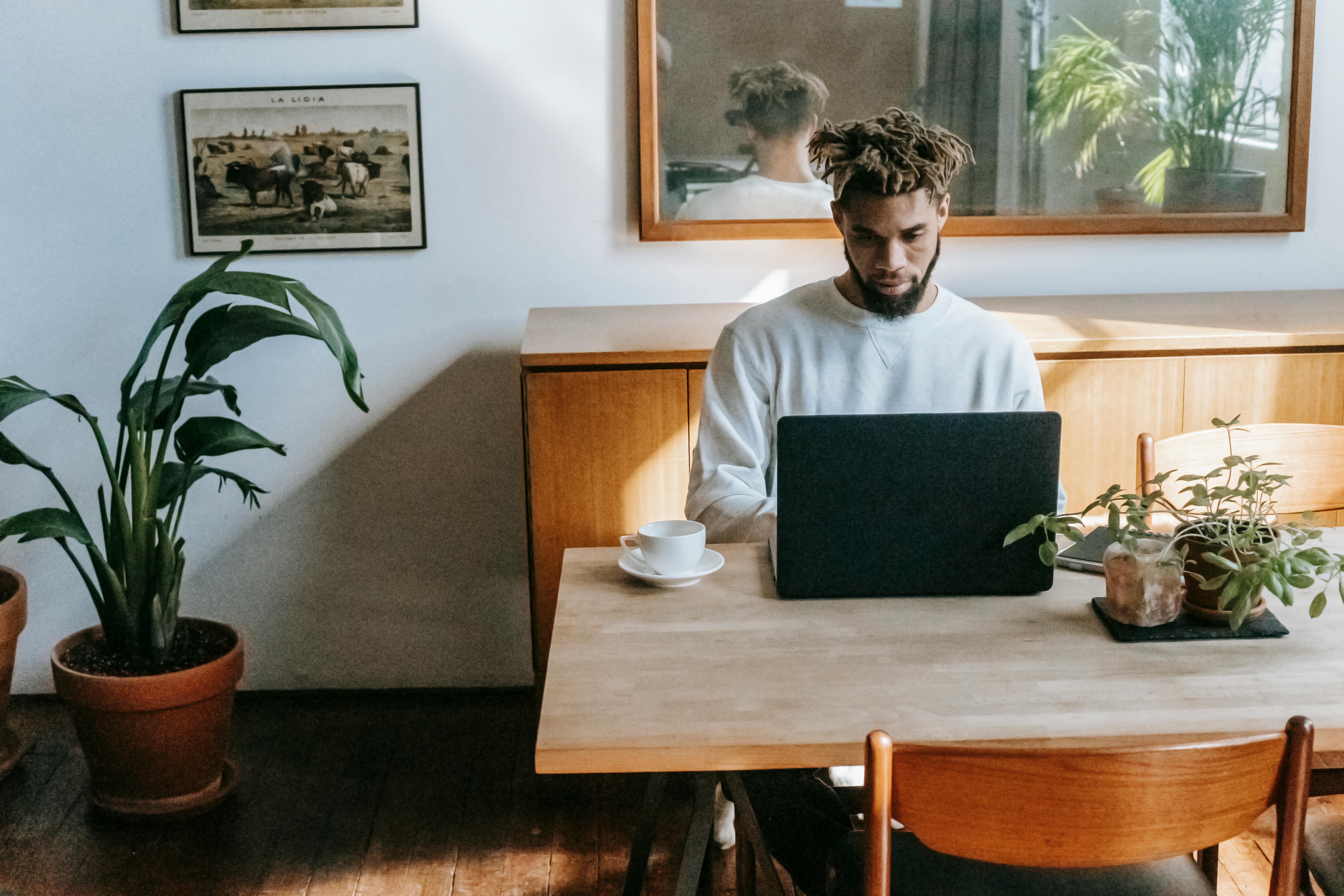
I recently assumed the position of Director of Design for True North Magazine based in Anchorage, Alaska. This has taken me on a journey to discover trends in magazine design and as usual there is no solid answer.
Magazine layout is not that different from other graphic layouts, especially advertisements / promotions. Essentially, your magazine is the product you are trying to sell, which makes the similarities between product promo design and magazine layout very understandable. As we see more and more, advertising is the new art. The creators of Nike’s latest campaign are today’s Da Vinci. Just don’t say that to hardcore artists. So most of these design types promoting something or another move along the general design trends. I sat down and looked at the hottest designs of 2012 and decided that the two biggest trends are cool typography and simplicity.
Simplicity is the ultimate form of sophistication. – Leonardo da Vinci
Typography, being the font style, has become a big problem in recent years. There are literally entire companies that all do is design fonts or check which fonts a company should use. Finding the right font is absolutely critical to good design. The downside to this is that it can be time consuming and not particularly interesting. I recently had a dream (or more accurately a nightmare) in which I was choosing fonts all night long. All night I scrolled down a list of sources! I woke up exhausted and ready to explode. So if you ever see a font that you like, write down the name and save it for later so you don’t have to search for it again.
Simplicity. Cleaning. Purity. Blank space.
All of these have become increasingly fashionable in recent years. Just look at the can of Pepsi. Six years ago it was a mess of bubbles and swirls and writing, today it is nothing more than a solid blue logo. Leaving space is absolutely essential for a good design.
One last detail that I leave you with is that gray and white are the colors of the year, if you can call them color. Apple computers have pushed gray where possible and I love it. Of course, you can only keep someone interested in gray and white for so long, so a single bright color used sparingly can be very affective and fun.


Recent Comments